Reports
You can already see every contract in the repository, but a list of rows does not answer questions like “how much are we signing this quarter”, “what is stuck right now”, or “how long does an NDA actually take to close”. Answering those by hand means exporting to a spreadsheet and counting.
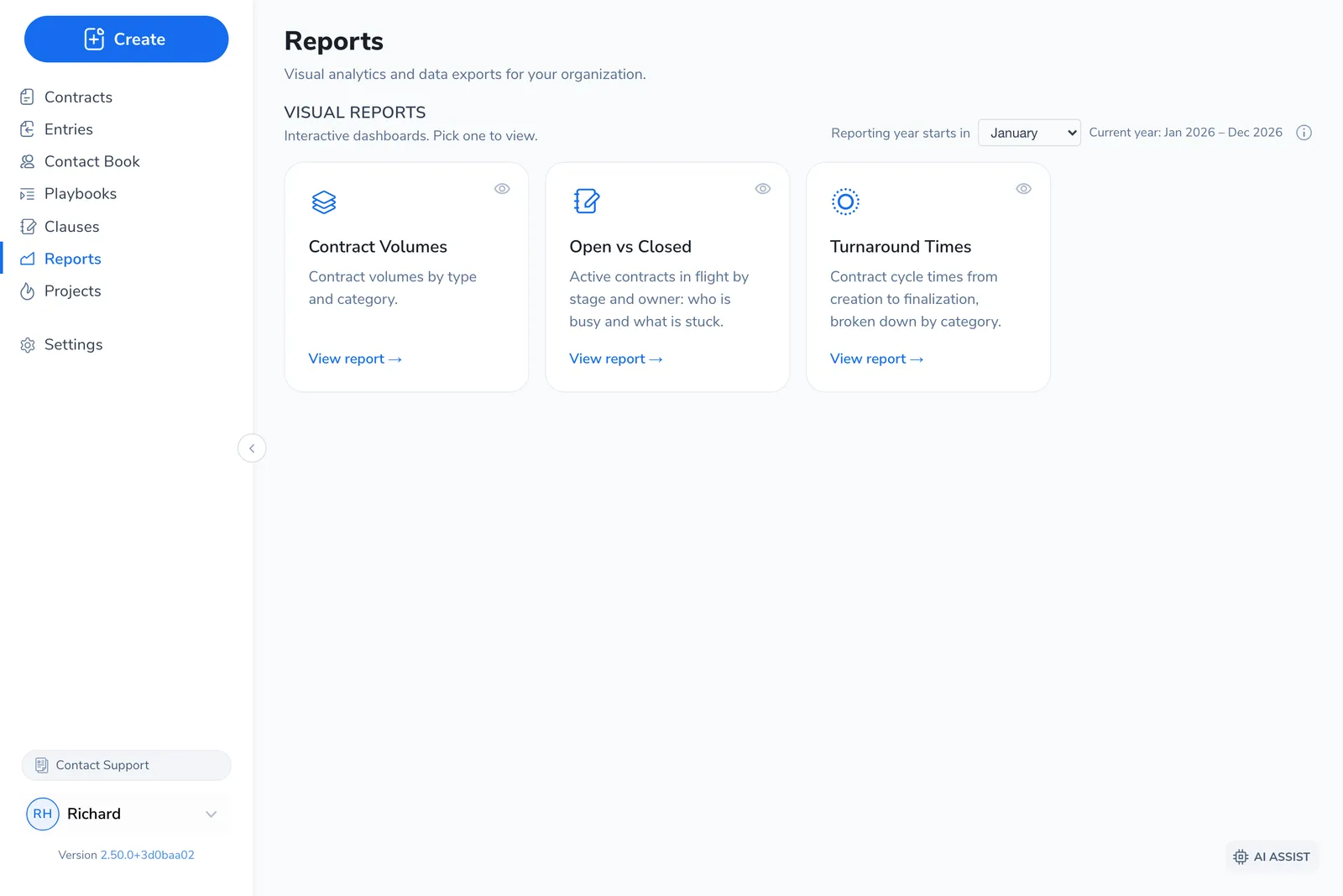
Reports is the area that answers them for you. Open Reports from the left navigation to find interactive charts of your organization’s contract activity, plus a catalog of downloadable data exports.
”Dashboard” usually means the contract list, not Reports
Section titled “”Dashboard” usually means the contract list, not Reports”People often call the contract list their “dashboard”. That list, where you find, filter, and track individual contracts, is the repository, not Reports. See Contracts for everything you do there.
Reports is a separate, analytics-only area. It does not show individual contracts to act on. It shows aggregate figures across all of your organization’s contracts. If you came here looking for one specific agreement, you want the repository instead.
What Reports contains
Section titled “What Reports contains”Reports has two halves.
Visual reports are interactive dashboard cards. Pick one to open it, then set the date range, comparison period, and breakdown. Three cover the core questions, each anchored to a different point in time:
There are four cards in total:
- Contract Volumes: how many contracts were created, broken down by type, owner, group, or a contract property, with a comparison to the previous period.
- Open vs Closed: active contracts in flight right now, by stage, owner, and age, so you can see who is busy and what is stuck.
- Turnaround Times: how long contracts take from creation to close, by category and paper source.
- Custom Insights: charts built specifically for your organization. If none are configured, this card shows a “Contact us” prompt instead.
Data exports is a catalog of downloadable files. Pick an export, set a date range and any filters it offers, then Download a CSV or Excel file for your own analysis. These exports are configured for your organization by your administrator and our team, so the list you see is specific to your account.
A couple of conventions trip people up: Turnaround Times reports the median, not the average, and each card measures from a different date, so the same contract can land in different windows. Reading the Reports explains what each card measures and how to read it.
What’s in this section
Section titled “What’s in this section”What Reports does not do
Section titled “What Reports does not do”Two things customers reasonably expect that Pactly does not offer today.
- There is no build-your-own-report tool. The four visual cards are fixed, and the data export catalog is curated for your organization rather than assembled by you. To add a new chart, column, or export, contact us and we will configure it.
- There are no scheduled or emailed reports. Reports are pull-only: open the page to read a card, or click Download to pull an export. Nothing is generated and sent on a schedule.
Who can see Reports
Section titled “Who can see Reports”Access to Reports is controlled by role, and it is not on by default for everyone.
Administrators see every visual card and export. For other people, each card and each export is shared individually, so an administrator decides who sees what. There is also a dedicated Reports role for people who need analytics and exports but should not edit contracts.
Related
Section titled “Related”- Reading the Reports
- Data Exports & Downloads
- Why don’t I see everything in Reports?
- Contracts overview: the repository, where you find and act on individual contracts
- Custom Views: save filtered, column-selected views of the contract list, and export them to Excel